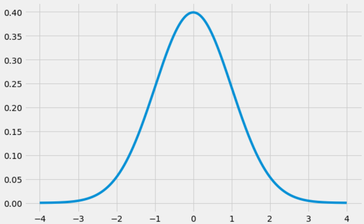
«Колокольная кривая» — это прозвище, данное форме нормального распределения , которая имеет отчетливую форму «колокола»:

В этом руководстве объясняется, как создать кривую нормального распределения в Python.
Как создать кривую нормального распределения в Python
В следующем коде показано, как создать кривую колокола с помощью библиотек numpy , scipy и matplotlib :
import numpy as np
import matplotlib.pyplot as plt
from scipy.stats import norm

#create range of x-values from -4 to 4 in increments of .001
x = np.arange(-4, 4, 0.001)

#create range of y-values that correspond to normal pdf with mean=0 and sd=1
y = norm.pdf(x,0,1)

#define plot
fig, ax = plt.subplots(figsize=(9,6))
ax.plot(x,y)

#choose plot style and display the bell curve
plt.style.use('fivethirtyeight')
plt.show()
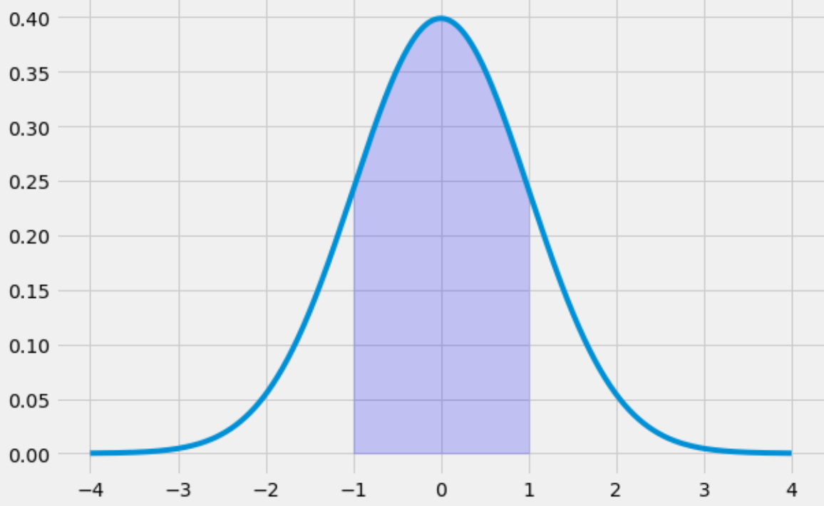
Как заполнить кривую нормального распределения в Python
Следующий код иллюстрирует, как заполнить область под кривой нормального распределения в диапазоне от -1 до 1:
x = np.arange(-4, 4, 0.001)
y = norm.pdf(x,0,1)

fig, ax = plt.subplots(figsize=(9,6))
ax.plot(x,y)

#specify the region of the bell curve to fill in
x_fill = np.arange(-1, 1, 0.001)
y_fill = norm.pdf(x_fill,0,1)
ax.fill_between(x_fill,y_fill,0, alpha=0.2, color='blue')

plt.style.use('fivethirtyeight')
plt.show()
Обратите внимание, что вы также можете стилизовать график по своему усмотрению, используя множество параметров стиля matplotlib.Например, вы можете использовать тему «солнечный свет» с зеленой линией и зеленой заливкой:
x = np.arange(-4, 4, 0.001)
y = norm.pdf(x,0,1)

fig, ax = plt.subplots(figsize=(9,6))
ax.plot(x,y, color='green')

#specify the region of the bell curve to fill in
x_fill = np.arange(-1, 1, 0.001)
y_fill = norm.pdf(x_fill,0,1)
ax.fill_between(x_fill,y_fill,0, alpha=0.2, color='green')

plt.style.use('Solarize_Light2')
plt.show()
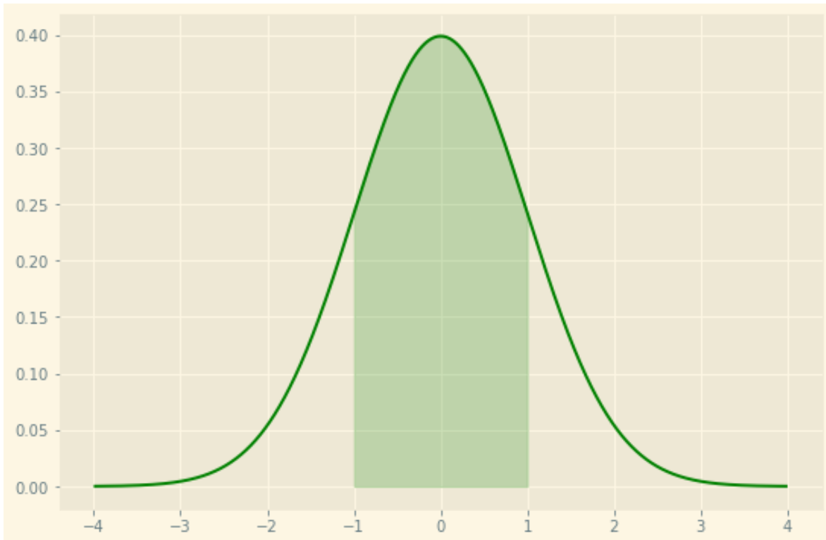
Вы можете найти полное справочное руководство по таблицам стилей для matplotlib здесь .