Вы можете отобразить несколько строк на одном графике Matplotlib, используя следующий синтаксис:
import matplotlib.pyplot as plt

plt.plot(df['column1'])
plt.plot(df['column2'])
plt.plot(df['column3'])

...
plt.show()
В этом руководстве представлено несколько примеров того, как построить несколько линий на одной диаграмме с использованием следующего кадра данных pandas:
import numpy as np
import pandas as pd

#make this example reproducible
np.random.seed (0)

#create dataset
period = np.arange (1, 101, 1)
leads = np.random.uniform (1, 50, 100)
prospects = np.random.uniform (40, 80, 100)
sales = 60 + 2\*period + np.random.normal (loc=0, scale=.5\*period, size=100)
df = pd.DataFrame({'period ': period,
 'leads ': leads,
 'prospects ': prospects,
 'sales ': sales})

#view first 10 rows
df.head (10)


 period leads prospects sales
0 1 27.891862 67.112661 62.563318
1 2 36.044279 50.800319 62.920068
2 3 30.535405 69.407761 64.278797
3 4 27.699276 78.487542 67.124360
4 5 21.759085 49.950126 68.754919
5 6 32.648812 63.046293 77.788596
6 7 22.441773 63.681677 77.322973
7 8 44.696877 62.890076 76.350205
8 9 48.219475 48.923265 72.485540
9 10 19.788634 78.109960 84.221815
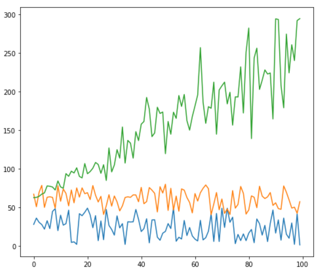
Постройте несколько строк в Matplotlib
В следующем коде показано, как построить три отдельные линии на одном графике в matplotlib:
import matplotlib.pyplot as plt

#plot individual lines
plt.plot(df['leads'])
plt.plot(df['prospects'])
plt.plot(df['sales'])

#display plot
plt.show()

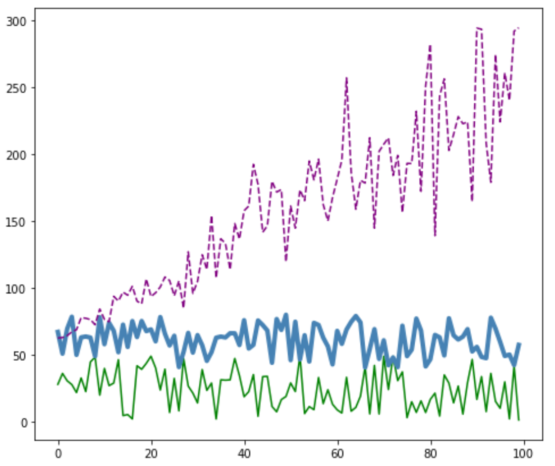
Настройка линий в Matplotlib
Вы также можете настроить цвет, стиль и ширину каждой линии:
#plot individual lines with custom colors, styles, and widths
plt.plot(df['leads'], color='green')
plt.plot(df['prospects'], color='steelblue', linewidth= 4 )
plt.plot(df['sales'], color='purple', linestyle='dashed')

#display plot
plt.show()
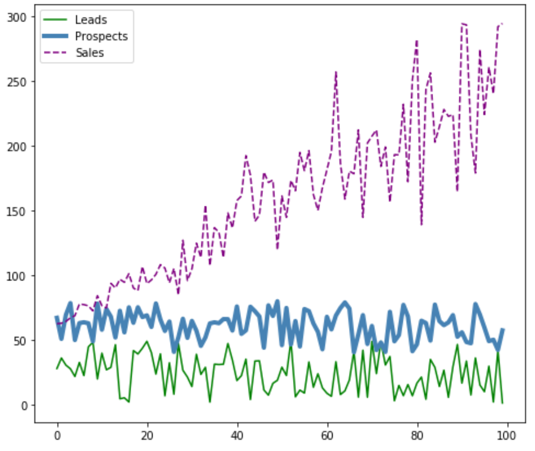
Добавить легенду в Matplotlib
Вы также можете добавить легенду, чтобы различать строки:
#plot individual lines with custom colors, styles, and widths
plt.plot(df['leads'], label='Leads', color='green')
plt.plot(df['prospects'], label='Prospects', color='steelblue', linewidth= 4 )
plt.plot(df['sales'], label='Sales', color='purple', linestyle='dashed')

#add legend
plt.legend()

#display plot
plt.show()
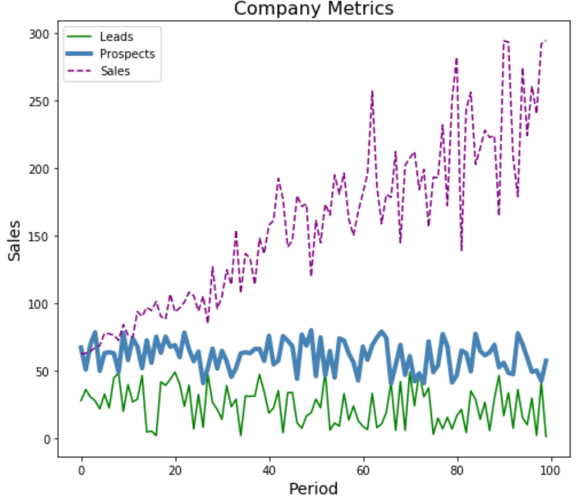
Добавьте метки и заголовки осей в Matplotlib
Наконец, вы можете добавить метки осей и заголовок, чтобы сделать график завершенным:
#plot individual lines with custom colors, styles, and widths
plt.plot(df['leads'], label='Leads', color='green')
plt.plot(df['prospects'], label='Prospects', color='steelblue', linewidth= 4 )
plt.plot(df['sales'], label='Sales', color='purple', linestyle='dashed')

#add legend
plt.legend()

#add axis labels and a title
plt.ylabel('Sales', fontsize= 14 )
plt.xlabel('Period', fontsize= 14 )
plt.title('Company Metrics', fontsize= 16 )

#display plot
plt.show()
Вы можете найти больше руководств по Matplotlib здесь .